Sonfed - gas station
Sonfed is the brand identity of a gas station unlike the typical roadside stop. Located in a natural setting alongside a river, with no nearby café, bistro, or place to stop and stay a while, the station was conceived from the start as more than fuel. The project required building a brand that could speak for the place.
Concept
Research into the gas station industry revealed a consistent visual pattern: pins, drops, flames, roads - predictable symbols repeated across competitors. The brief called for something minimal and fresh, so that direction was set aside entirely.
The logo was built from the name itself. All concepts worked with either the S or SF letterforms, keeping the mark tied directly to Sonfed’s identity rather than its category.
For color, dark navy and orange, opposites on the color wheel, were selected for their contrast, nighttime visibility, and distinctiveness.
The combination had not been used in the Romanian gas station market, which made it an immediate differentiator.

The Challenge
The primary challenge was scale.
This wasn’t branding for a product that lives on packaging or a screen, it was branding for a physical place.
The logo would need to function across architecture, signage, uniforms, merchandise, and environmental applications. Every decision had to account for permanence and real-world visibility, including legibility at night.
![]()
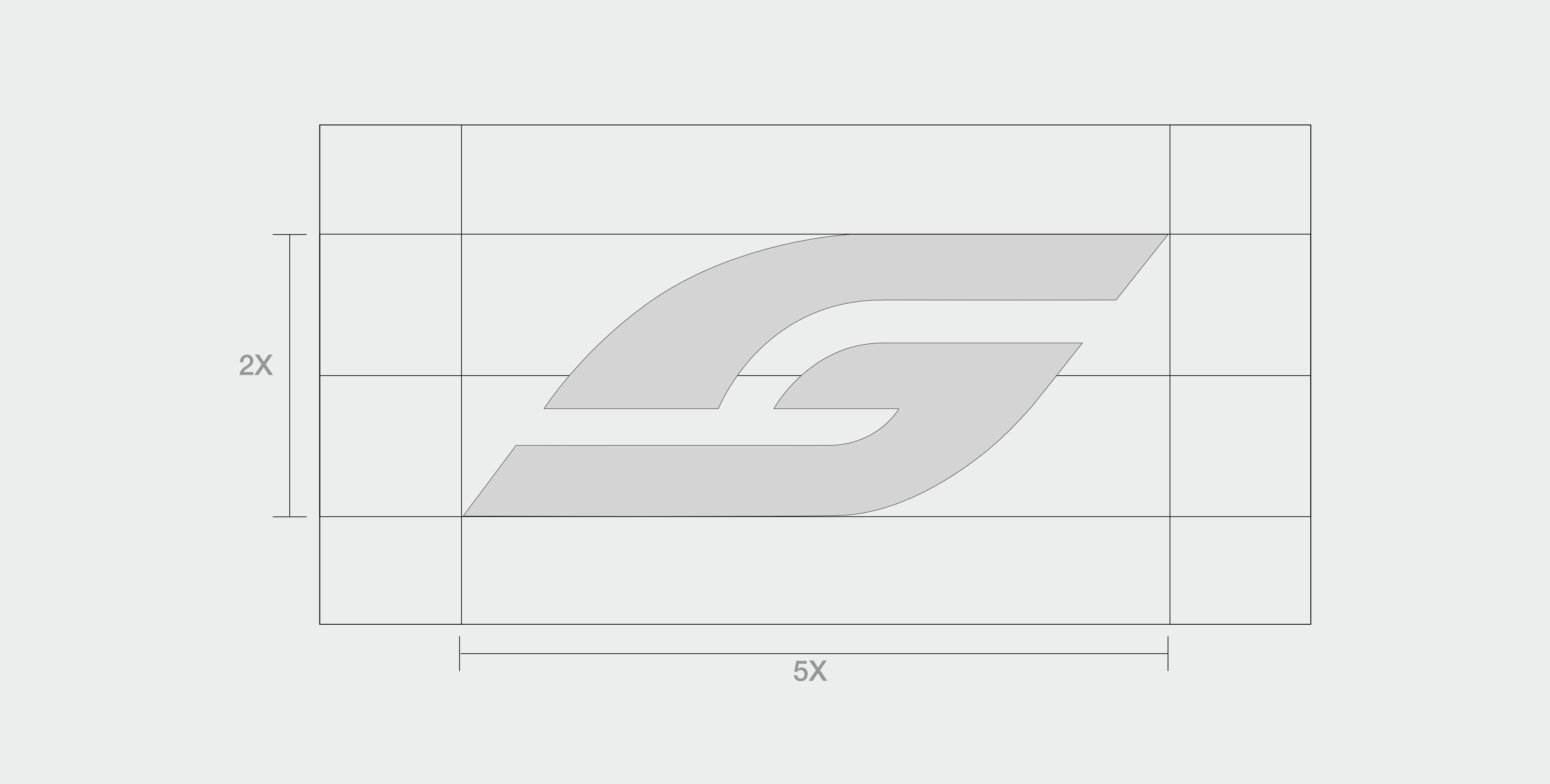
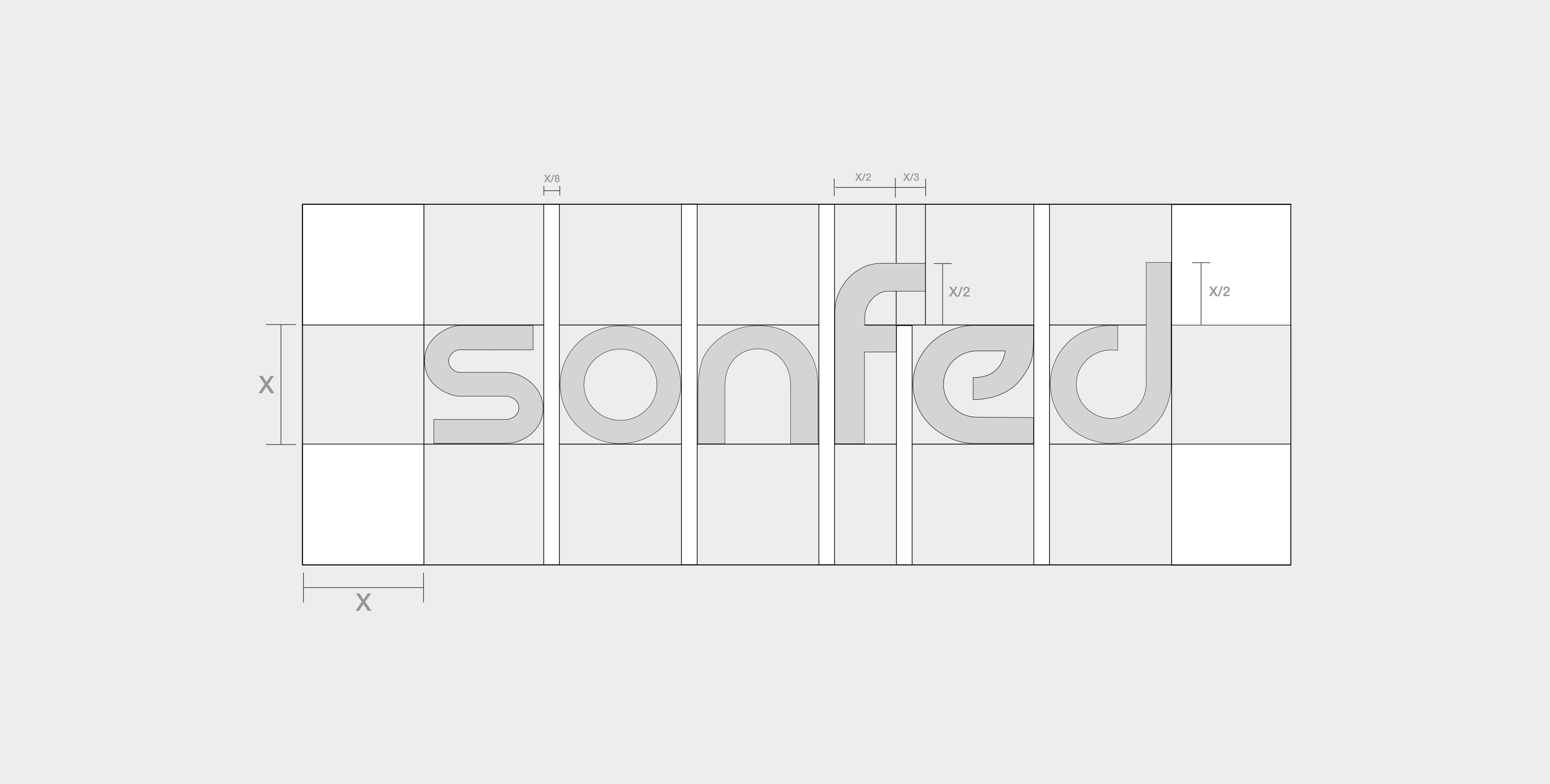
A fuel brand lives across wildly different scales, from a fuel pump label to highway signage. Fixed measurements break under that range, so I based the whole construction on one relational unit, X (the height of the lowercase “o” in the wordmark).
Defining every proportion against X instead of millimetres means the logo holds its integrity at any size, and anyone reproducing it later gets the same result without guesswork.
![]()